Eleven Xpress Jamaica LTD
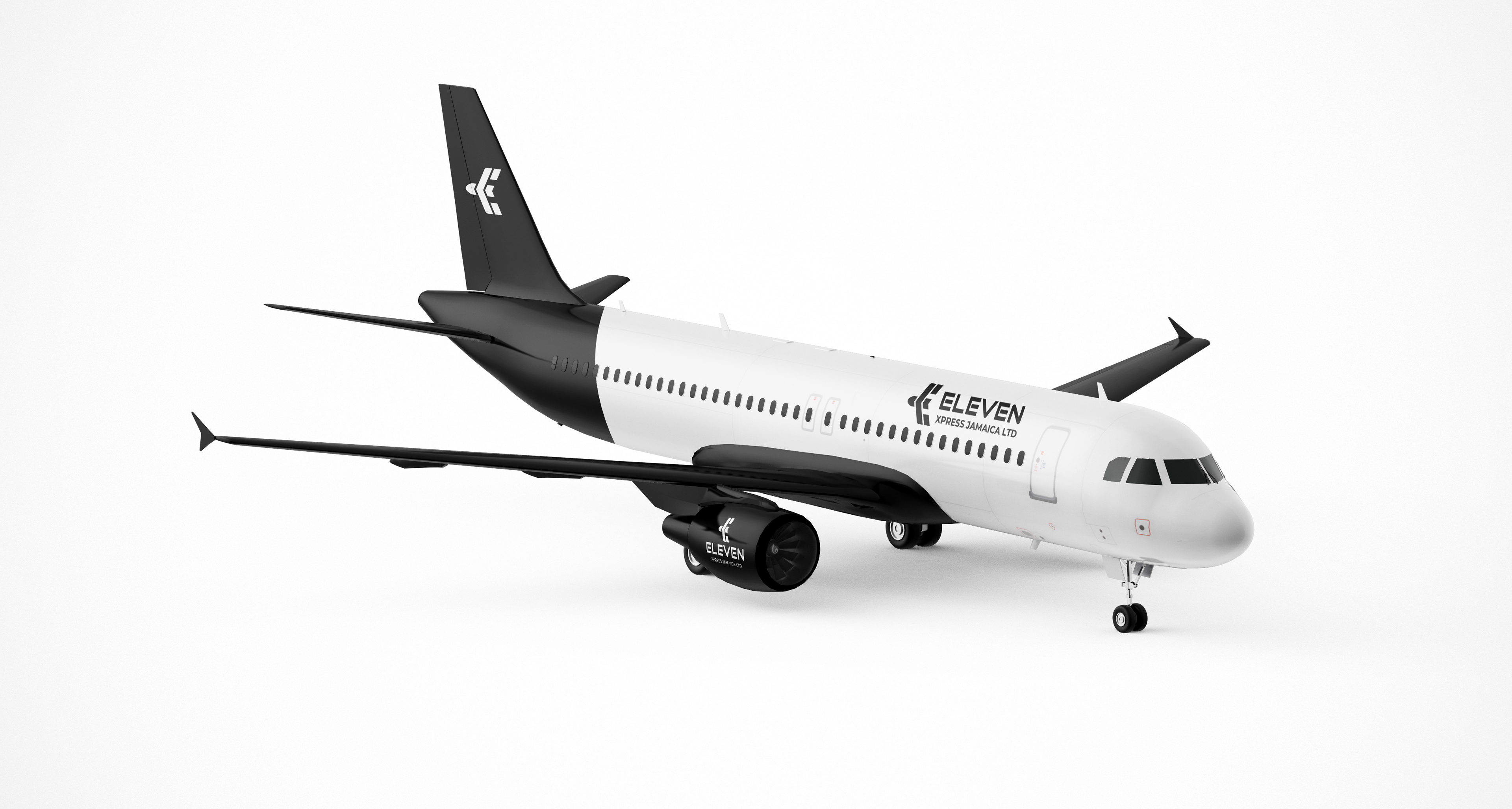
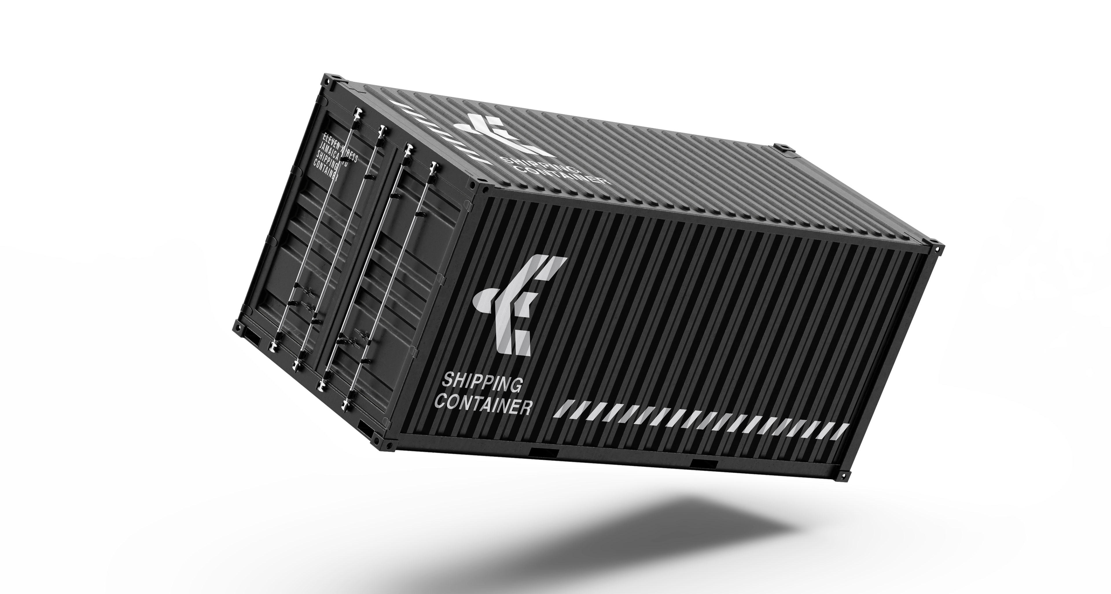
Eleven Xpress Jamaica LTD is a logistics and freight service dedicated to making international shipping simpler and more accessible for Jamaicans. Operating through both air and sea freight, the company focuses on convenience, reliability, and efficiency—connecting customers to their cargo from overseas with confidence.
Design Objective
The goal of the visual identity was to create a distinctive and modern brand mark that communicates:
• Speed and forward movement
• Trust and reliability in logistics
• International connectivity
• Simplicity and recognition across digital and physical applications
Because freight companies often rely heavily on clarity and trust, the design needed to feel strong, professional, and memorable, while remaining flexible for use across packaging, uniforms, vehicles, digital platforms, and marketing materials.

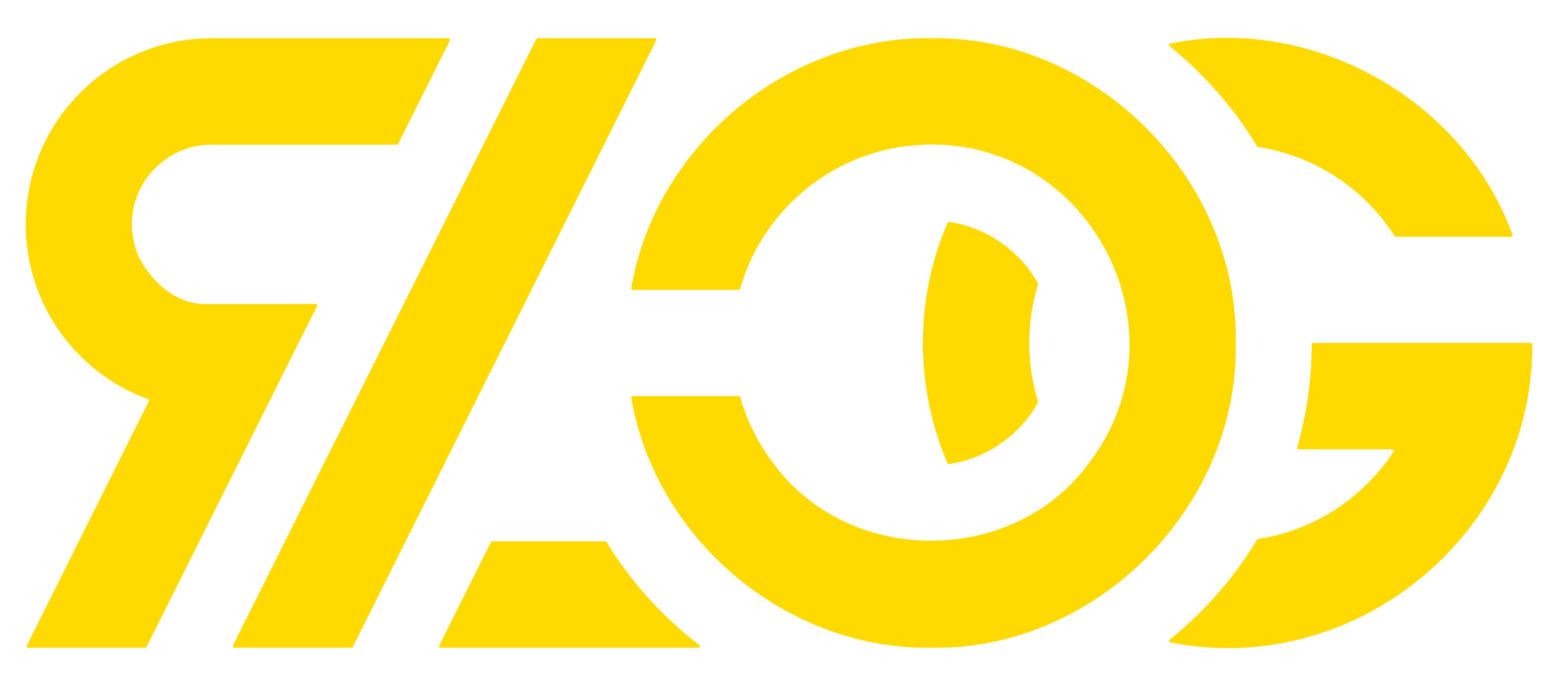
Symbol Concept
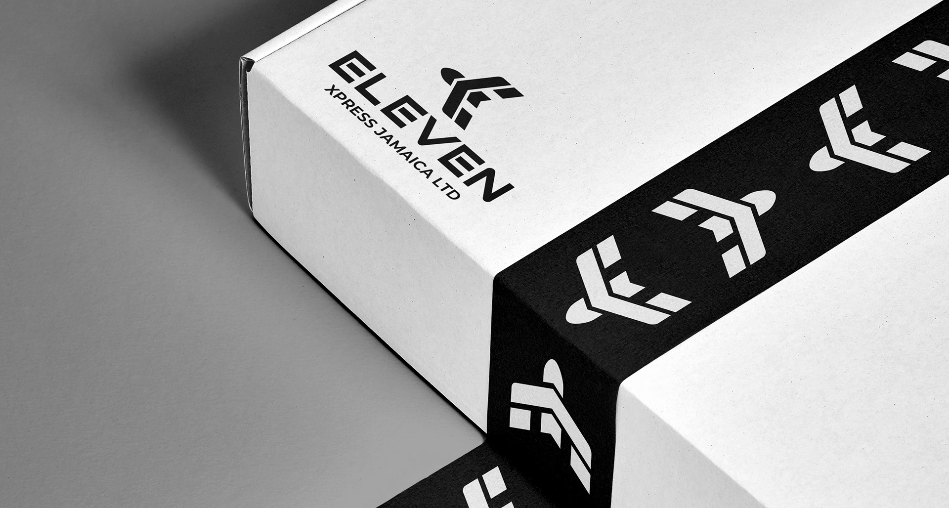
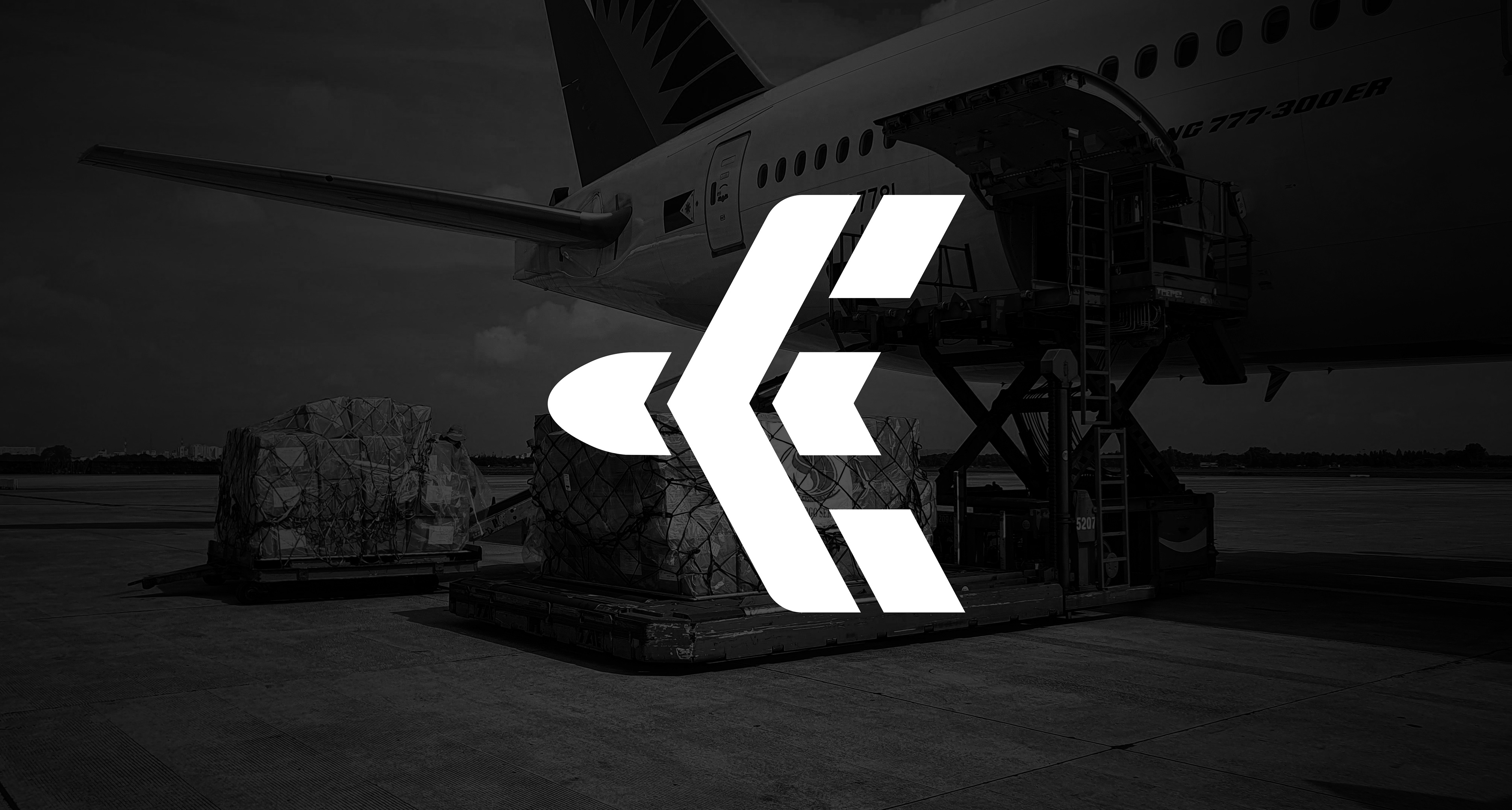
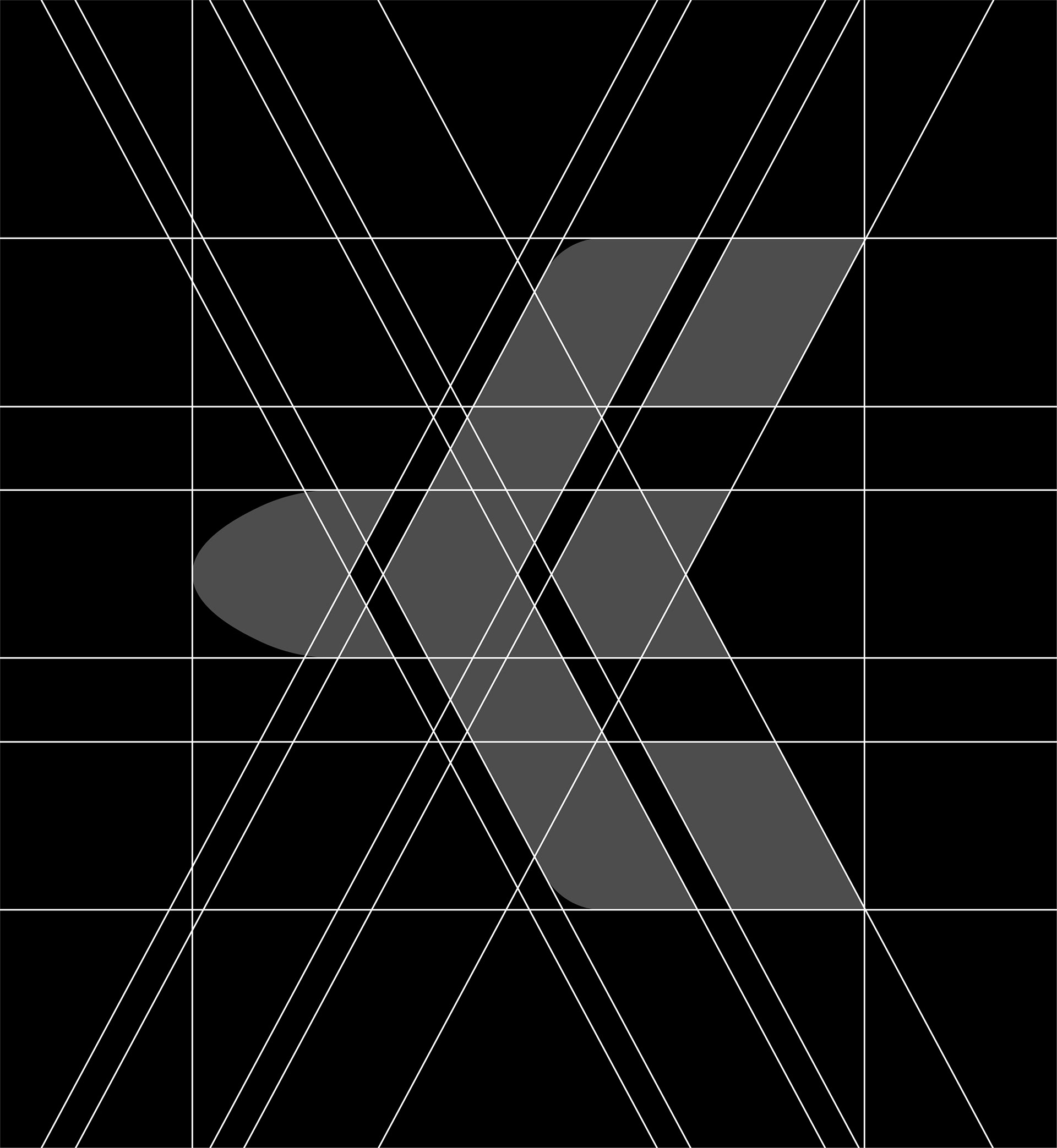
The symbol for Eleven Xpress Jamaica LTD was designed as a multi-layered visual mark that merges the brand’s initials with the concept of cargo transportation. Rather than relying on a literal shipping icon, the mark uses abstract geometry to communicate movement, direction, and global connectivity.
At its foundation, the symbol forms a stylized “E,” representing the first letter of Eleven. The strong angled structure creates a bold and recognizable starting point for the brand while maintaining a modern and professional appearance.
The central shape also represents in-transit movement, visually suggesting forward momentum. The directional angles give the impression of motion, reflecting the continuous flow of packages traveling from international origins toward their destination.
Within the structure, the inner form subtly creates half of the letter “X,” referencing the second word in the company name, Xpress. This dual-letter construction allows the symbol to represent both parts of the brand name in a single cohesive mark.
Completing the concept is the silhouette of an airplane form, created through the balance of the shapes and the rounded element behind the mark. This detail reinforces the company’s connection to air freight, cargo transport, and delivery logistics, while also symbolizing speed and long-distance connectivity.
Together, these elements combine to create a symbol that represents:
• E — the initial of Eleven
• Half X — referencing Xpress
• Directional motion — representing shipments in transit
• Airplane symbolism — representing cargo transportation
• Half X — referencing Xpress
• Directional motion — representing shipments in transit
• Airplane symbolism — representing cargo transportation
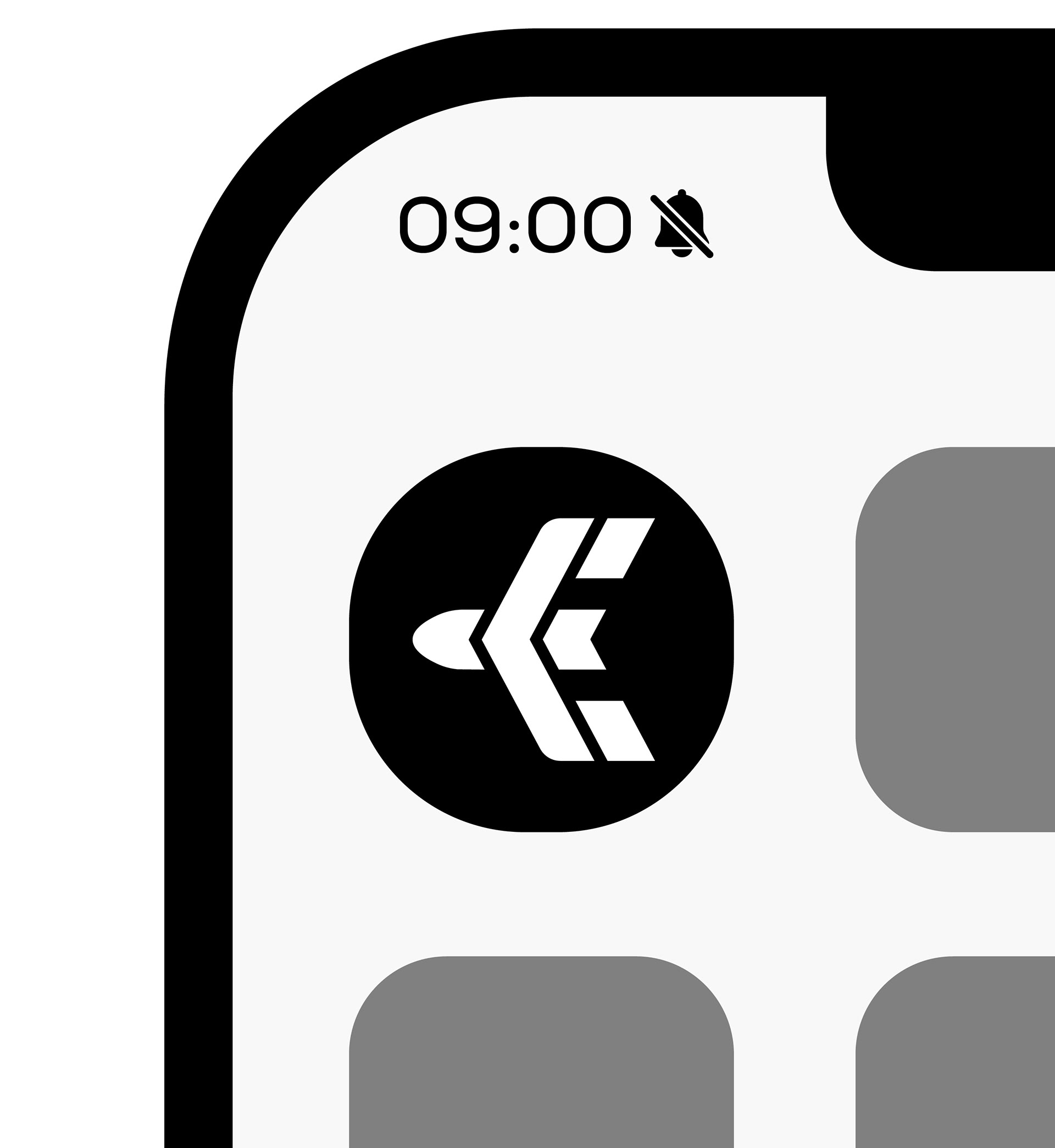
The result is a clean, modern, and versatile mark that visually communicates the brand’s purpose while remaining simple enough to perform effectively across digital platforms, packaging, uniforms, and shipping materials.